Data Visualization
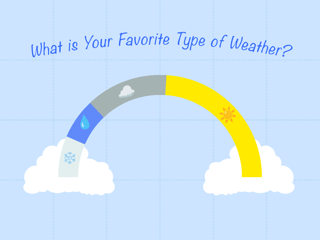
I surveyed 26 people on what their favorite weater is, a majority voted Sunny!
I chose to display it as a half circle graph for the rainbow effect!
I surveyed 26 people on what their favorite weater is, a majority voted Sunny!
I chose to display it as a half circle graph for the rainbow effect!